ShopDreamUp AI ArtDreamUp
Deviation Actions


Description
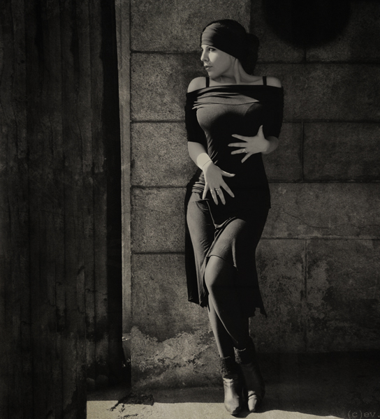
cat walks..
trampling down clouds.
laughs, despising losses.
she is ready to fly up.
after all...
all that was lost...
was not necessary.
- - -
model : me
for amazing teamwork i thank my sweet Michael
(today`s sunny morning old cemetery)


trampling down clouds.
laughs, despising losses.
she is ready to fly up.
after all...
all that was lost...
was not necessary.
- - -
model : me
for amazing teamwork i thank my sweet Michael
(today`s sunny morning old cemetery)
Image size
544x600px 223.97 KB
Make
NIKON CORPORATION
Model
NIKON D40X
Shutter Speed
10/2500 second
Aperture
F/5.3
Focal Length
46 mm
ISO Speed
200
Date Taken
Apr 12, 2009, 1:24:13 AM
© 2009 - 2024 bitterev
Comments293
Join the community to add your comment. Already a deviant? Log In
Overall, I really like this.
The good:
- This photo does a wonderful job of accentuating your figure, and judging from the pose that goes along with your vision for the image.
- I really like your choice of tone. Gives just a bit of a natural/earthy tone that fits in with the architectural elements.
- You are beautiful. It's not fair to people who are merely extremely talented, or extremely beautiful, that you are both.
- The exposure on the blacks (including highlights and shadows on the clothing) is very well balanced.
- The exposure on the stone wall is just right.
- You are positioned perfectly along the horizontal.
- I love the round shadow/recess near your head, perfectly placed.
Areas needing work:
- I'm not sure I agree with the decision to crop with the top so close to your head, and the bottom so close to your face. Give some space to breathe! <img src="e.deviantart.com/emoticons/w/w…" width="15" height="15" alt="
- A little too much light on the sliver of ground that is lit. A different crop would have made it less awkward.
- I would have liked to see just a hint more brightness in the brightest of the highlights. This image is rightly subdued, but one little spark in the right place would make it much more powerful.
Overall, very very good-- a pleasure to see this in my watchlist. I always look forward to your works, especially self portraits.